Store Experience Design: Complete Guide to Creating Retail Spaces That Drive Revenue and Loyalty
.svg)
.svg)
.svg)
.svg)
Retail environments must reduce friction and build confidence. As soon as a store experience makes purchasing unnecessarily difficult, it is underperforming.
When a customer enters a store and fails to orient themselves, their confidence is quietly eroded. A strategic approach can raise conversion rates and communicate to shoppers that returning is worth their while.
This is why store experience design isn’t sold as a decorative layer or a vague exercise in brand storytelling. Instead, it is engineering a space to work with human behaviour and influence the shopper’s experience from browsing to purchase.
When the space aligns with the shopping mission, the commercial impact becomes measurable. Dwell time increases in high-margin zones, navigation becomes intuitive, and the 'defensive shopping' mindset is replaced by exploration.
Understand the fundamental pillars of store experience that dictate whether a retail space functions as a high-performance sales tool or merely a high-cost overhead…
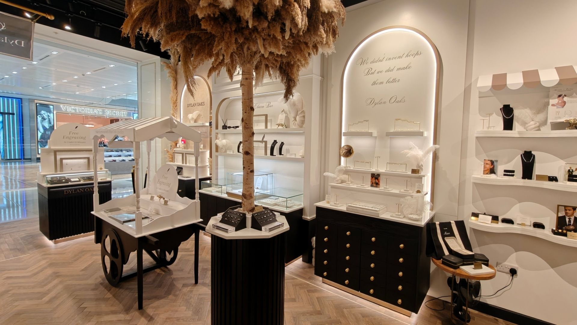
The critical first ten seconds

The opening ten seconds of a customer’s visit are the most commercially significant.
This is the 'threshold effect,' a brief window where a shopper subconsciously decides whether to engage with the store or browse defensively. If the entrance is cluttered, the sightlines are blocked, or the immediate environment feels chaotic, the customer experiences instant cognitive load.
They don't necessarily leave, but they do speed up, narrowing their field of vision and ignoring peripheral displays. This initial friction effectively caps the potential value of the visit before it has even begun.
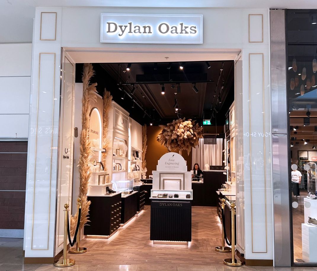
Effective store experience design treats the entrance as a decompression and orientation zone.
The goal is to provide immediate clarity: a clear view of hero categories and an intuitive understanding of where to go next. If a store forces a sharp turn or presents a wall of competing messages the moment a customer steps inside, it triggers a 'flight' response that manifests as rushing. By providing a moment of physical and visual space, you allow the customer to slow their pace to a 'browsing speed.'
This transition is what allows for product discovery and, ultimately, the cross-selling that drives average transaction value. Getting the entrance right removes the psychological barrier that prevents customers from seeing the very products they came to buy.
How retail space planning shapes customer emotions and shopping behaviour
Sensory layers and the reality of comfort
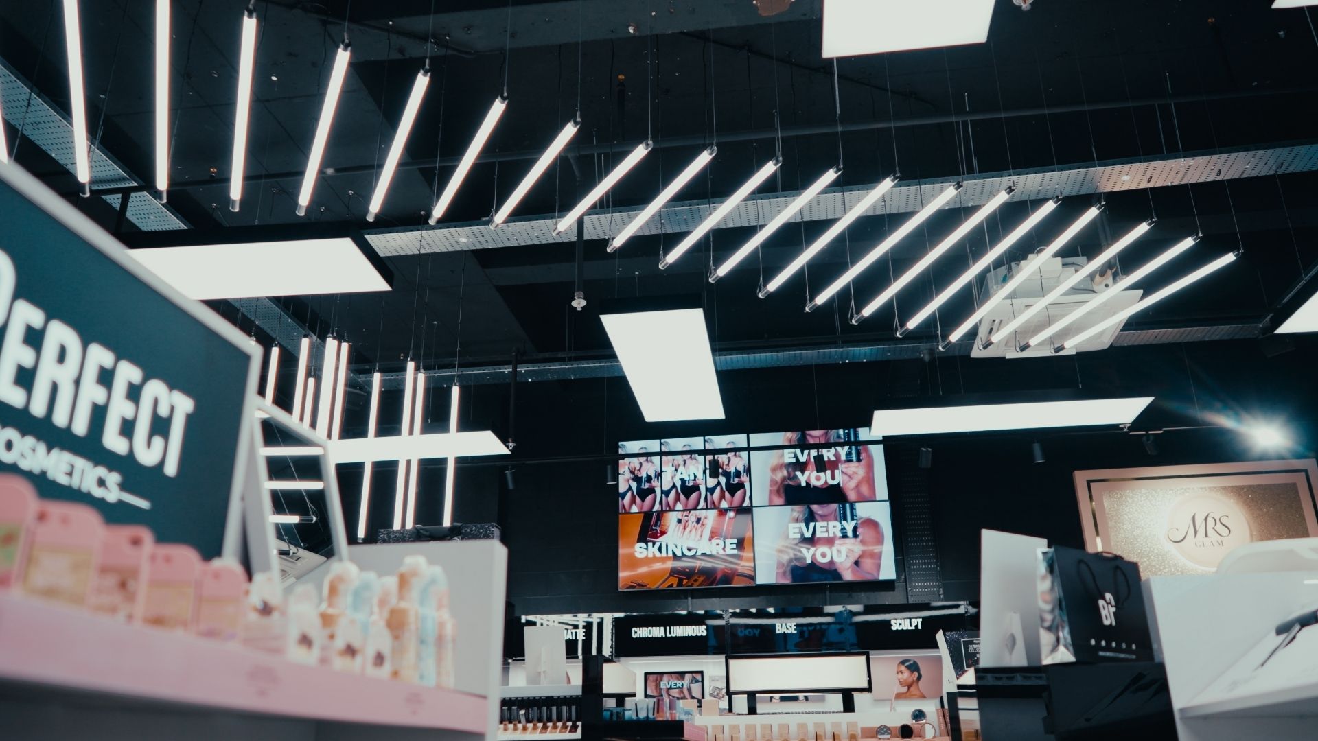
While visual merchandising often takes the lead in design discussions, physical comfort is what actually controls dwell time.
A customer who is too hot, struggling with harsh acoustics, or squinting under poor lighting will instinctively look for the exit. These sensory factors are often dismissed as simply ‘atmosphere,’ but their role is purely functional.
In high-consideration retail, such as luxury goods or complex electronics, the environment must facilitate a 'slow' brain state. Harsh, reflective surfaces that bounce sound around a store create a sense of franticness, making it harder for staff to close sales and easier for customers to feel overwhelmed.
Acoustic control is perhaps the most undervalued lever in the retail toolkit.
An echoey, loud environment increases stress and reduces the time a customer is willing to spend at a consultation point or till. By introducing materials that absorb sound, the space has zones where conversation feels private and effortless.
Similarly, lighting should be treated as a tool for 'product truth' rather than just ambience. If a customer cannot accurately judge the colour or texture of a garment or material, they will postpone the purchase. The cost of poor lighting is not just a dim store; it is the high rate of returns and abandoned baskets.
Read more on
Engineering natural flow and navigation
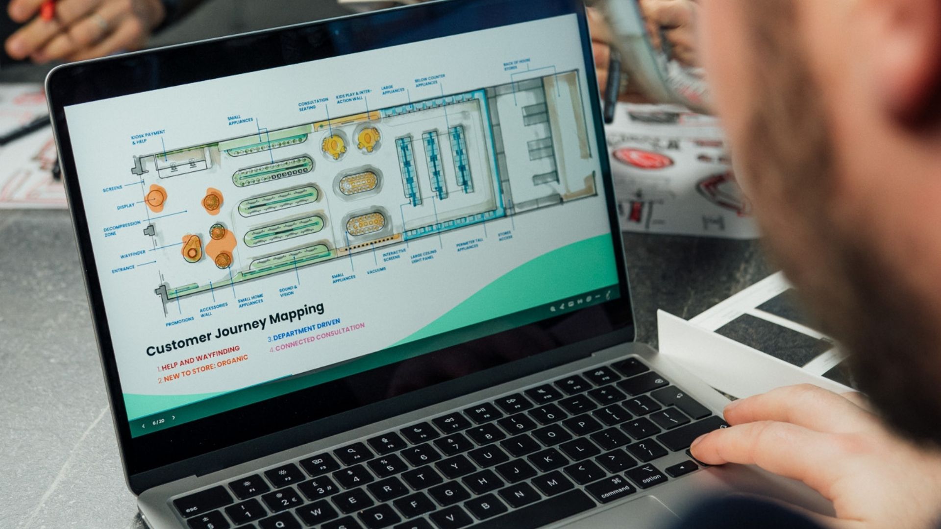
A store layout is a behavioural map and an opportunity to influence shoppers without forcing them onto a single, rigid path.
True expertise in store experience design lies in creating a layout that supports multiple shopping intents simultaneously. This requires a 'fast lane' for those with high intent and 'discovery loops' for those open to browsing.
When a customer feels they have lost their sense of direction, they stop looking at products and start looking for the exit.
Activating Dead Zones and Managing Operational Flow
'Dead zones' are often a result of poor layout, but it can lead retailers to believe the product is the cause of ‘failure’.
Realistically, every store has pockets of low engagement that sit in the 'shadows' of the customer flow. These typically occur behind structural pillars, in deep corners, or at the end of long, monotonous aisles where visual fatigue sets in.
When a customer reaches a psychological endpoint, they subconsciously check out, turning back toward the main thoroughfare rather than exploring further.
Activating these cold spots requires a deliberate disruption of the store’s physical rhythm to pull a customer into the dead zone:
- Use a shift in fixture height or a high-level focal point to signal that there is something worth seeing beyond the immediate obstacle.
- Increase the lux levels or change the colour temperature in a corner to create a 'draw' effect, making the space feel purposeful rather than forgotten.
- Repurpose underutilised space for high-utility functions such as click-and-collect points, sampling stations, or consultation desks. This forces a change in the customer’s pathing and breathes life into stagnant areas.
However, a layout that succeeds in activating dead zones on a quiet Tuesday must also be robust enough to handle the commercial pressure of a Saturday afternoon.
Operational design is the bridge between aesthetic layout and peak-time reality. If a 'discovery loop' becomes a bottleneck when two trolleys meet, or if the queue for the till blocks the primary sightline to a hero category, the experience collapses.
The most effective store designs account for the 'swell' of peak trading. This means maintaining wide primary arteries that allow for fast-paced movement, while using the store's secondary 'veins' to host slower, more immersive discovery.
High-impact touchpoints: Fitting rooms and transactions
In any retail environment, not every square metre carries the same commercial weight. There are specific ‘moment of truth’ touchpoints where a customer decides to either commit to a purchase or abandon the journey entirely.
When these critical zones are neglected, the store stops being a high-performance sales tool and starts becoming a liability. Instead, clever store experience design engineers solutions that remove the psychological and physical barriers to a sale.
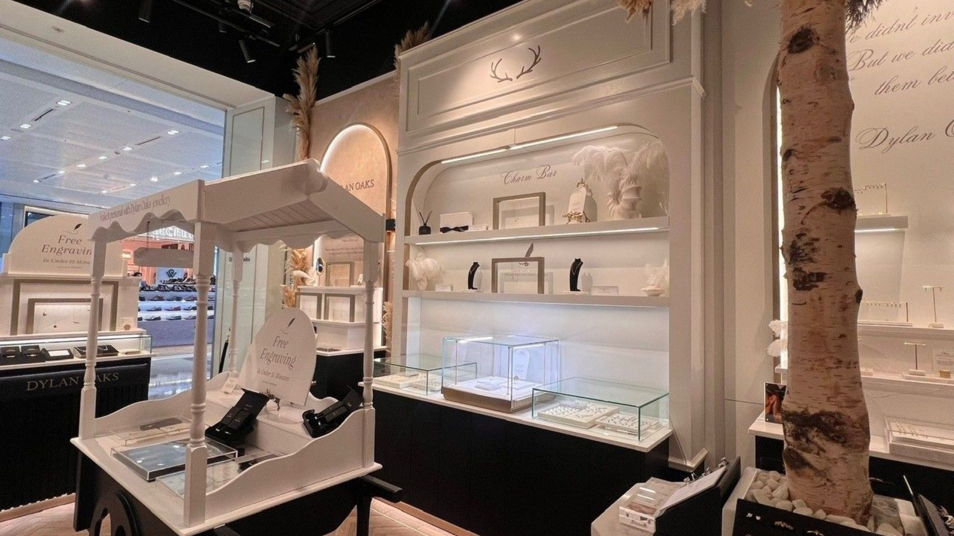
Fitting rooms: The engine room of conversion
The fitting room is the highest-conversion zone in any apparel or sports retail environment, yet it is frequently the most overlooked.
This is the one place where a customer is at the absolute peak of their purchase intent. A cramped cubicle with poor lighting and nowhere to place personal belongings immediately creates friction, reducing confidence and the chance of purchase.
From a design and manufacturing perspective, the fitting room should be treated as a high-performance decision space.
Flattering, accurate lighting is essential to give customers confidence in what they see in the mirror and to build trust in the product itself. Beyond the visuals, the tactile reality creates a mini-journey in the cubicle itself.
Robust hooks that can actually hold a heavy winter coat, integrated seating that doesn't feel like an afterthought, and a ‘what do I do next?’ system for unwanted items.
The point of sale: Removing final friction
.jpg)
Friction is found everywhere, and the till point is the final opportunity to create a seamless transition. It’s a space that can solidify customer loyalty, but it is often where the experience collapses into frustration.
Queue design manages the psychological perception of time and keeps a customer on track, with clear, legible signage and pathways to the till. When this experience builds confidence, the customer is less at risk of ‘transaction anxiety’ and stores see larger sales volumes.
In practice, the checkout area needs to be comfortable enough to prevent a customer from second-guessing their basket while they wait, but efficient enough to maintain throughput. This is why technology must earn its keep in this space, as mobile POS or self-checkout kiosks should only be introduced if it demonstrably removes a hurdle.
In high-value or service-led retail, replacing expert human interaction with a screen can often increase hesitation. The goal here is to design a point of purchase that feels like a natural conclusion to the visit, rather than an operational bottleneck.
Dive deeper into the benefits of POS merchandising here.
Adapting design for volume and context
A universal 'one size fits all' approach to store design is a commercial risky route to take.
The design decisions that work for a high-volume flagship in a major city will likely fail in a low-volume destination store.
In high-traffic environments, the priority is throughput and durability. Materials must withstand constant contact, and signage must be legible from a distance and at pace. Here, the experience is defined by the absence of friction.
In destination retail the customer has already 'spent' the time to travel to you. The design can afford to be more experimental, using slower progression and more immersive storytelling. Here, products aren’t as much the focus, as the experience itself is there to validate the customer’s journey.
These context variations can optimise a retail space to suit its physical presence while also accommodating varied customer demographics.
For example, an older demographic may require more frequent seating and clearer, high-contrast signage, while a younger, digitally-native audience may expect more integration between their mobile device and the physical shelf.
Read more: What really matters in Store Design
Measuring the commercial impact of design
When making changes to a store, the golden rule is to avoid the 'scattergun' approach. A store experience isn’t a strategic asset without KPIs. Holding the space accountable focuses the efforts on moving the most telling metrics in the right direction.
By switching from ‘it looks better’ to ‘it performs better’, stores can monitor key data points to understand how the space is executing the design tactics. In practice, misalignment of dwell time figures and correlations in average transaction values can indicate customers are staying longer but spending the same due, alerting retailers to address the environment to shift from confusing to engaging.
Conversion rate by zone is a particularly powerful metric. By tracking how many people enter a specific category area versus how many purchase from it, you can identify exactly where the design is failing to 'close the deal.'
Changing lighting, layout, and signage simultaneously makes it impossible to attribute success to a single factor. Rigorous store design involves baseline measurement, a controlled intervention, and an honest appraisal of the resulting data.
From design concept to operational reality
A retail store can look flawless in a 3D render and still fail on the high street if the delivery choices undermine the operational intent.
Most performance gaps come from predictable friction points: value-engineering that strips out the sensory comfort customers actually notice, lighting that is too complex for store teams to maintain, and layouts that look spacious on a floor plan but buckle under the pressure of Saturday footfall.
Budget realities are vital to planning, and we advocate for investing heavily in the anchors of the store experience to maximise the elements that directly shift customer behaviour and protect the long-term ROI of the fit-out:
- Entrance and navigation to maintain sale momentum through to the final transaction, without overwhelming the customer.
- The lighting system is the primary driver of product ‘truth’ and confidence, and has to be carefully implemented.
- High-wear durability avoids customers interpreting a "tatty" store as a sign of declining brand quality.
The best outcomes are achieved when design and manufacturing work as a single, integrated system. By locking in technical specifications early and defining the interfaces between materials, the delivery phase becomes a rollout of a proven solution rather than a series of compromises on the shop floor.
Store experience design as a commercial lever
The most effective store experience design is the kind that makes the act of buying feel effortless.
It is a strategic tool that guides the customer through the first ten seconds of orientation, provides the sensory comfort required for deep browsing, and removes the friction from the final moments at the till.
Whether you are refreshing a single flagship or managing a multi-site rollout across the UK, the objective remains the same: make the product the hero and the purchase the natural conclusion.
If you want to go deeper into the specifics of retail performance, explore our supporting guides on Entrance Design, Acoustics, Lighting Psychology, or Multi-Generational Layouts.
Or, contact the Ripple team to see how we translate store experience design into commercial reality.

Chloe Simms

Author fullname
More from the Retail Journal

What is Retail Interior Design?
Ripple has been designing retail spaces that generate fantastic results for retail stores for years. So, the team has put their expertise together and broken down everything you need to know about retail interior design.

From Display to Understanding: Showroom Design that Explains at a Glance
Too many showrooms look polished but leave visitors guessing what a product really does. You want your space to do more than just display, it must make every product instantly clear and trustworthy.
How Sustainable Retail Design Helps Brands Create a Space that Feels Premium
The pressure to make your retail space feel premium while choosing eco-friendly materials is real, and it’s only growing. Yet, many retailers worry sustainability means compromising on style or delivery.
Reach Us
Let’s start the conversation.

Greater Manchester OL4 2AB