Showroom Design That Sells: Complete Guide
.svg)
.svg)
.svg)
.svg)
Introduction: Why showrooms win (or lose) on design decisions
The first step is to stop thinking of a showroom as a shop. In retail, people often arrive ready to buy and use browsing to confirm a choice.
In a showroom, they arrive to decide. They want tangible options to compare and reinforce the confidence in their buying decisions, especially those that feel high-stakes.
Reducing risk for shoppers is a challenge, and it changes everything: layout, product density, lighting, sound. That’s why showroom design is rarely about aesthetics for its own sake.
The design either makes decision-making easier, or it quietly makes it harder. The design gives customers the tools to understand differences, imagine the product in their world, and feel comfortable making a purchase.
But it can make it harder to decide too, with poor design overwhelming shoppers and increasing uncertainty, causing them to “think about it” someplace else.
This guide breaks down what actually drives performance in showroom interior design.
- The psychology of how people behave in display-focused spaces
- The logic of showroom layout and zoning
- How to create product moments that land
- The technical decisions (lighting, materials, services) that make or break the final environment
Understanding showroom psychology
Knowing how your customer thinks is a science, and being conscious of their thought patterns can be directly translated into showroom design.
Showroom customers typically rely on the space to de-risk a decision they want to make. They aren’t there to shop around, even when they’re excited their default mode is “prove it to me”.
The space has to prove the quality is real, prove the differences justify the price, prove the choice won’t come back to bite them in six months.
That’s why showrooms behave differently to most retail. The purchase tends to be higher value, the lifespan is longer, and the range architecture is more complex (variants, finishes, configurations, add-ons).
If the space makes that versioning hard to understand, you get the classic showroom outcome: lots of interest, plenty of browsing, and a high rate of “we’ll think about it”.
Hesitation usually comes from one of three frictions:
- Comparison friction: people can’t see differences clearly without walking back and forth, relying on memory, or asking staff to interpret it for them.
- Evidence friction: customers want to touch, test, and verify – but interaction is awkward, gated, or unclear.
- Progression friction: they don’t know what “the next step” is, so they hover, disengage, or leave to continue the decision online.
The commercial aspect of a showroom design is to simply reduce these frictions deliberately, and successfully. A showroom can be visually impressive and still underperform if it increases mental load. The moment there are too many options presented with no structure, hero moments are lost to a lack of comparison logic and beautiful displays stand in the way of interaction and engagement.
It’s a complex system for what seems to be a fairly simple concept on the surface, but the psychology deep-dive of shoppers has played an integral part in improving the sales performances of showroom designs.
Showroom design is confidence design
.jpg)
A useful way to think about it: in a showroom, customers are doing three jobs at once.
First, they’re collecting evidence. They touch materials, open drawers, test mechanisms, compare finishes under light, and look for cues that signal quality.
Second, they’re reducing uncertainty. They want to understand what’s included, what’s optional, what differs between ranges, and what the “real” product looks like versus the best photo online.
Third, they’re seeking reassurance from staff and the environment. The space itself should communicate that choices are structured, differences are legible, and the next step is clear.
When showroom design only considers aesthetics the opportunity to provide clarity is immediately lost. There’s no room for customers to quickly find their answers to even basic questions: What am I looking at? How does it compare? What’s the best option for me? What happens next?
Clever showrooms will balance the load of design and psychology. It should look fantastic and give customers a space to make comparisons easily, while guiding their attention gently to lower cognitive load. All with the aim of creating moments that help people feel certain enough to proceed.
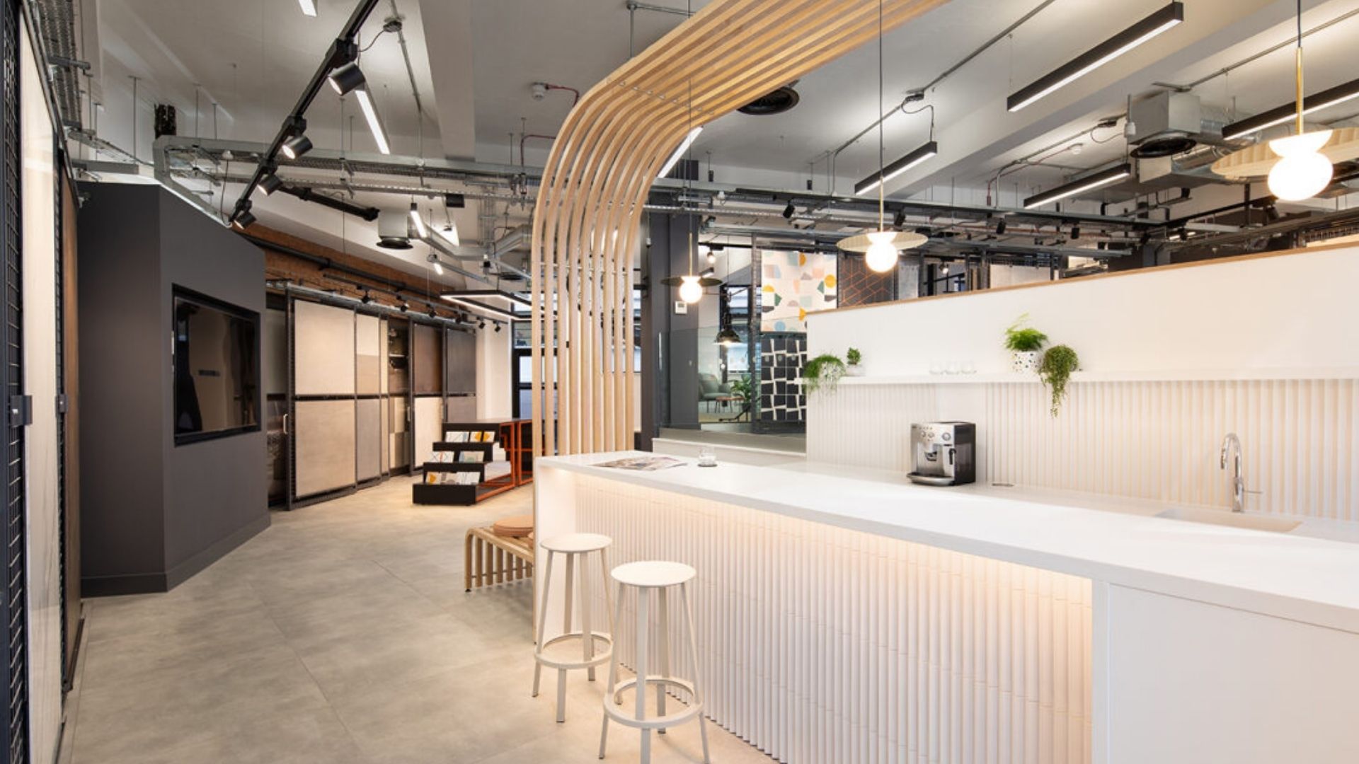
Strategic space planning
.jpg)
Showroom space planning is decision-architecture. The end product is shaping how customers explore, what they notice first, what they compare side-by-side, and where they feel comfortable pausing long enough to commit.
Most high-performing showrooms need at least three clear zones – even if they blend visually:
- Demonstration: where products are used, tested, opened, switched on, sat on, interacted with.
- Comparison: where differences between options are easy to see without walking laps.
- Consultation: where the conversation can become specific – without the customer feeling “on the spot”.
These zones tackle common mistakes and minimise the friction for shoppers. For example, a single continuous “gallery” might demonstrate a large range of products, but it often leaves customers stuck doing the work.
It asks them to remember what they saw, recall differences, and hold multiple price/feature variables in their head, increasing their fatigue and reducing confidence and the likelihood of a confident purchase.
A strategic approach is to plan comparison moments intentionally, with two or three variants positioned so the differences are obvious in one glance (finish, thickness, mechanism, scale, detail).
The flow of the space is just as important. Supporting the comparison phase of decision-making, customers can ‘get lost’ in a poorly signposted showroom. But, when gently guided through the space, micro-uncertainty is reduced and shoppers can begin to relax and explore.
You can guide without signage overload by using:
- sightlines that reveal a focal point from the entrance
- subtle thresholds (changes in floor finish, ceiling detail, lighting temperature)
- consistent product hierarchy (hero items always read as hero items)
- Read more about showroom zoning strategy
The consultation level of showroom design can be centered around your focal points. These should be commercial, not decorative and be the first ‘anchor’ view to help customers immediately understand what the offer will be: the type of products, the range level, and the brand positioning.
If the first thing they see is abstract “wow”, comprehension is delayed and the consultation phase is postponed. This ties back to the common understanding of the first 10 seconds being when people decide whether they feel oriented or lost.
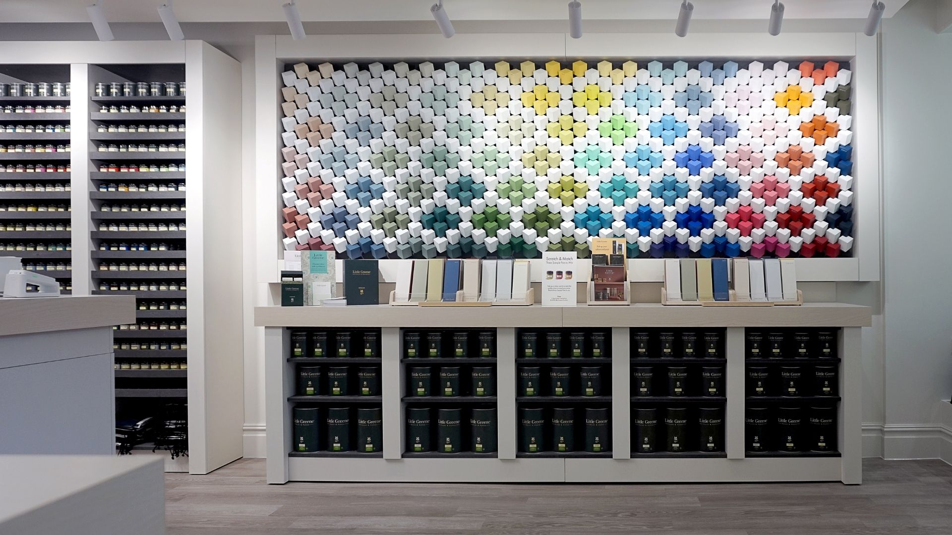
Product presentation and display strategy
Showroom design needs to make products look their best, but it should do more than find their best angle. The presentation of a product makes differences readable and makes benefits feel real – answering the core questions shoppers need to make a purchase.
Keep the showroom on track by identifying the role of each zone and designing it to be up to the task. When each display tries to do everything, nothing lands and shoppers feel frustrated.
Instead, when they walk through the doors the focus of each range should be clear. Some displays exist to win hearts (hero moments), while others exist to answer a customer’s practical objections (details, durability, maintenance). If shoppers know what they want but need some confidence, other zones can exist purely to enable comparison…
Hero moments that sell
A “hero moment” is a display designed to stop people and shift their perception of value. It’s not necessarily the most expensive product but it’s the one that best communicates what the brand stands for.
Hero moments work when they combine three things:
- a clear point of view (what makes this the “one”?),
- a controlled environment (lighting, sightline, space around it),
- and a tangible benefit customers can feel (comfort, finish quality, smooth movement, visual impact)
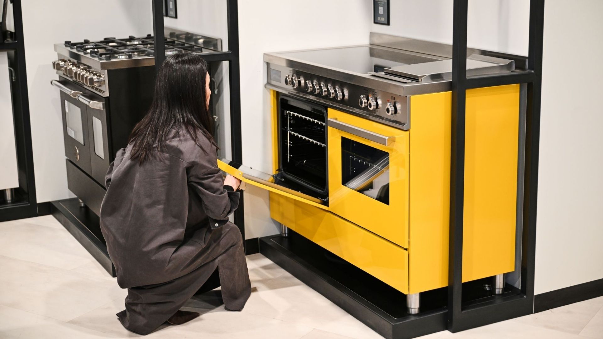
Demonstration beats static

If you sell “soft close”, show it. If you sell “scratch resistant”, invite touch. If you sell “modular”, make it easy to reconfigure.
People trust what they can test so any showroom’s demonstration zones need to be usable before they become theatrical. The confidence in the demonstration is all the pizazz a showroom needs for it to linger in a shopper’s mind.
Display density is a price signal
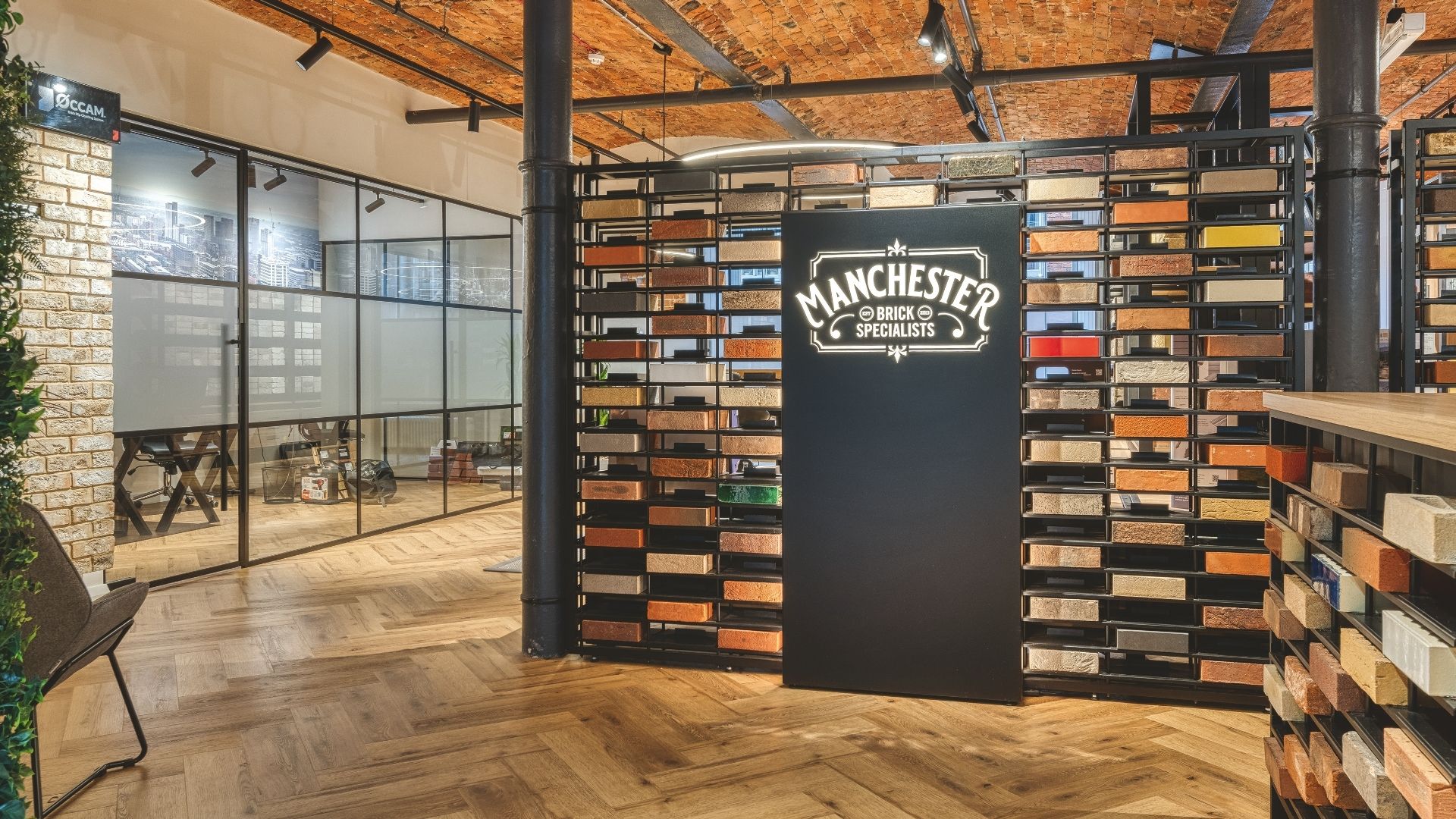
Display density is a fine balance between overcrowding and sparse shelving.
When a space is rammed full of products, shoppers can interpret it as ‘discount store quality’, and minimal products on shelves can raise concerns of ‘limited choices’.
These aren’t necessarily poor decisions, but the right execution depends on positioning and brand consistency.
If you’re value-led you should keep the selection broad but organised to keep comparison effortless. If you’re premium, give products room to breathe and make the details accessible. Both carefully serve customers what they’re looking for, while appealing to different principles…
Discover the VR Vision Room, and a live shower zone we designed for Carvers Interiors to help customers visualise products and experiment in real time here.
Creating the right environment
Showroom design that sells depends on a durable environment that combines ambience with a set of tactical decisions that shape attention, perception, and dwell time.
Showroom lighting has two jobs: make products look accurate and make the space legible. It’s these impacts that can create a product’s success…
Showroom interior design failure in showroom interior design is lighting the space beautifully while the products read wrong – finishes shift, colours flatten, textures disappear. Good lighting strategy typically layers:
- ambient light for general comfort and wayfinding,
- accent light to guide attention and create hierarchy,
- product light that reveals material truth (texture, colour, reflectivity)
If you sell multiple finishes, build a “truth zone”: a consistent lighting condition where customers can compare materials fairly. Otherwise, you’ll create false expectations that come back as complaints later.
Lighting is never simple – take a look at the Ripple Showroom Lighting Design guide to tailor your environment to maximise sales.
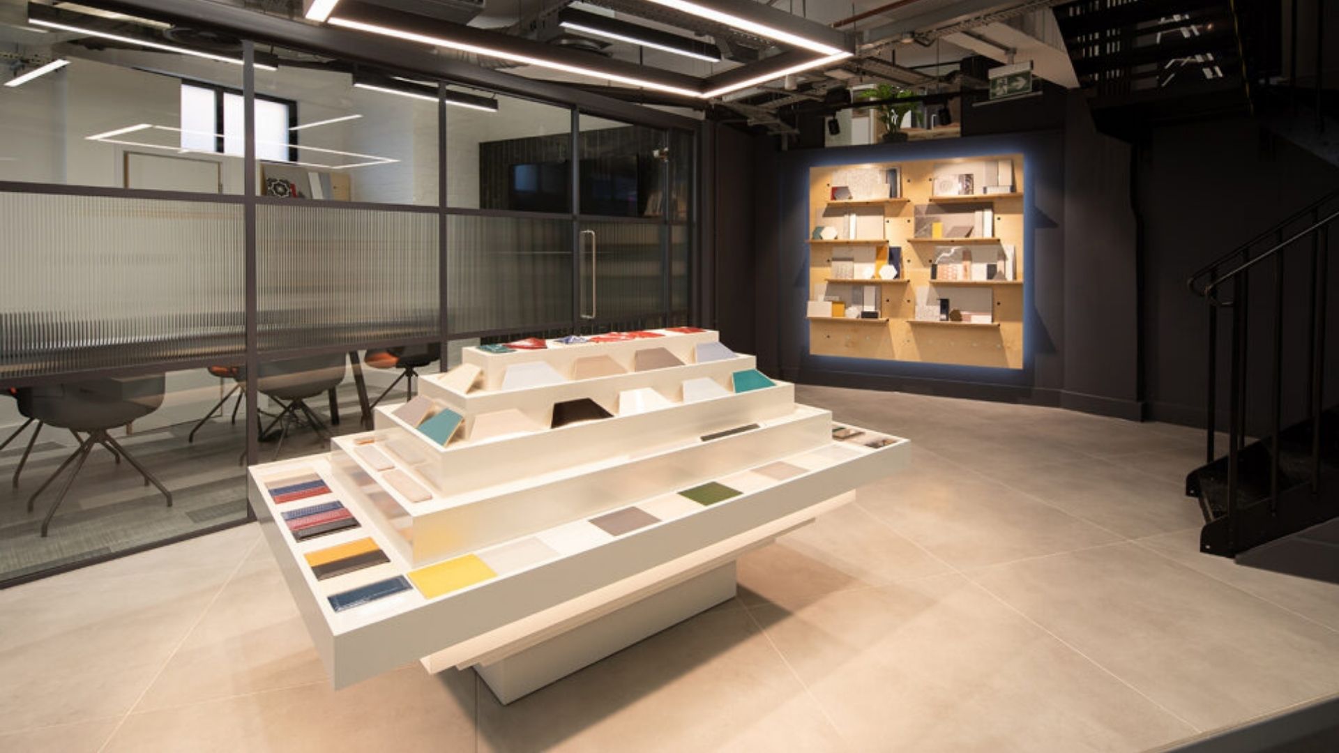
Materials and finishes: high-touch reality
In a showroom, materials are a part of the decision-making system for customers. They rarely look at products without reaching to feel it and compare it to their other choices.
The moment their hand makes contact is often the moment the product stops being theoretical and starts feeling ownable. If your finishes discourage touch, you lose the opportunity to reinforce confidence in their decision.
That’s why “nice” materials fail so often in real showrooms. A finish can look premium on day one and still underperform if it doesn’t survive actual use. Fingerprints, micro-scratches, scuffs, edge wear and cleaning chemicals show up fast in high-traffic environments, and deterioration gives shoppers a sense of poor quality rather than “wear and tear”.
The more useful question isn’t “is this premium?” It’s: what will this look and feel like after a year of real hands?
That includes the obvious elements such as cleanability and scratch resistance, but also the quiet signals. How stable does a fixture feel? Are its edges chipped or surfaces grubby? Does the handle mechanism feel solid, or is it flimsy when tested?
.jpg)
Materials also communicate positioning, when the detailing supports them. Gloss can read aspirational or cheap depending on what surrounds it and how it’s lit. Natural textures can read premium or unfinished depending on junctions, trim, and how well they’re maintained.
When these details are understood the goal can pivot towards building a palette that supports the brand promise and holds up under the touch pattern your showroom is designed to invite.
One practical trap: designing displays that look immaculate but subtly tell customers “hands off”. Locking hero products behind glass and having overly-premium finishes kills engagement. Instead, strip back the signage and clutter and allow the environment to feel ‘normal’. Customers will engage with wait-height surfaces and open sample trays, and the showroom remains functional without becoming a mess.
Materials for high-touch showrooms is a tricky puzzle to solve, but well worth the effort.
Acoustics and comfort: decision-making needs calm
Sound can influence shoppers to make a decision but it can equally make them feel overwhelmed.
If a showroom is echoey, loud, or full of competing audio zones, people shorten visits and avoid consultation. Softening acoustics controls reflection and lessens harshness to make conversation and confidence feel effortless.
Technical integration: flexibility is a sales tool
Finally, the invisible tactics in a showroom design: power, data, fixing points, concealed services, lighting control, and modular display systems.
A showroom that can’t adapt becomes stale quickly, so flexibility is there to let you refresh ranges and test layouts to keep the space commercially alive without rebuilding from scratch.
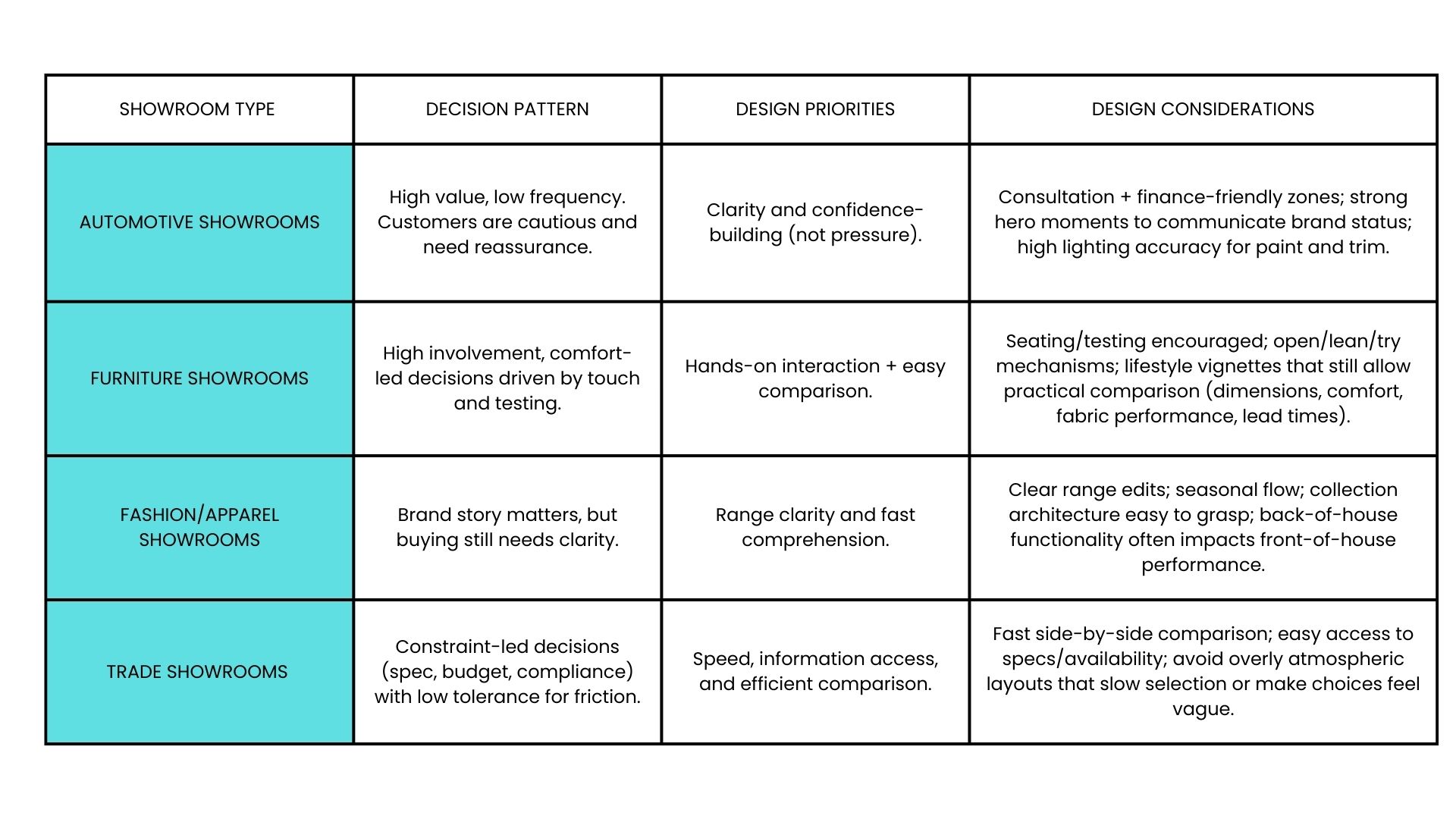
Different showroom types
Sector differences matter because the decision pattern changes.
From design to reality
.jpg)
A showroom can look perfect on paper and still underperform if the delivery choices undermine the intent.
Most issues come from predictable gaps: unclear product hierarchy, poor lighting coordination, value-engineering that removes the features customers actually notice, and late-stage changes that break the flow.
Budget reality is part of good planning. Investment into elements that change customer behaviour and steer them toward confident buying decisions will yield the best possible return. Ripple builds and delivers showroom environments, and the teams who do this well tend to treat design as commercial infrastructure, maximising the output of high-return elements…
- lighting (because it affects everything),
- hero displays (because they anchor perception of value),
- and flexible systems (because they protect the showroom’s lifespan).
The best outcomes come when design and build teams work as one system – with early decisions locked and interfaces defined, so the delivery phase isn’t a chain of compromises.
Showroom design is an investment in decision-making
The best showroom design ideas are the ones that make customers feel informed, confident, and ready to move forward.
That comes from psychology-led planning, clear zoning, purposeful product presentation, and technical choices that keep the environment accurate, durable, and adaptable.
If you’re planning a new showroom, refit, or refresh, treat the space like a decision tool. Make comparisons easy, make value tangible, and remove friction from the next step.
If you want to go deeper, explore the supporting guides on the confidence factor, zoning strategy, demonstration zones, lighting design, and high-touch materials – or see how Ripple approaches showroom design in practice.

Daniel Wolfenden

Author fullname
More from the Retail Journal

What is Retail Interior Design?
Ripple has been designing retail spaces that generate fantastic results for retail stores for years. So, the team has put their expertise together and broken down everything you need to know about retail interior design.

From Display to Understanding: Showroom Design that Explains at a Glance
Too many showrooms look polished but leave visitors guessing what a product really does. You want your space to do more than just display, it must make every product instantly clear and trustworthy.
How Sustainable Retail Design Helps Brands Create a Space that Feels Premium
The pressure to make your retail space feel premium while choosing eco-friendly materials is real, and it’s only growing. Yet, many retailers worry sustainability means compromising on style or delivery.
Reach Us
Let’s start the conversation.

Greater Manchester OL4 2AB